Last year we made over my best friend, Laila’s office. The room already had nice board and batten, and then we brought in some fun colors through the rug and accessories. The other day we were in the room and said, why we didn’t paint the room?! I’ve talked about how homes are always evolving, and Laila and I both decided a fun color would be nice to add. But not just any color, the color of the year! We also gave her IKEA bookcase an upgrade!
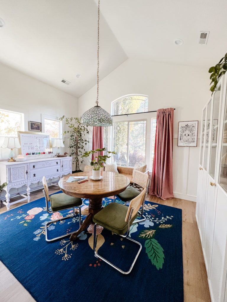
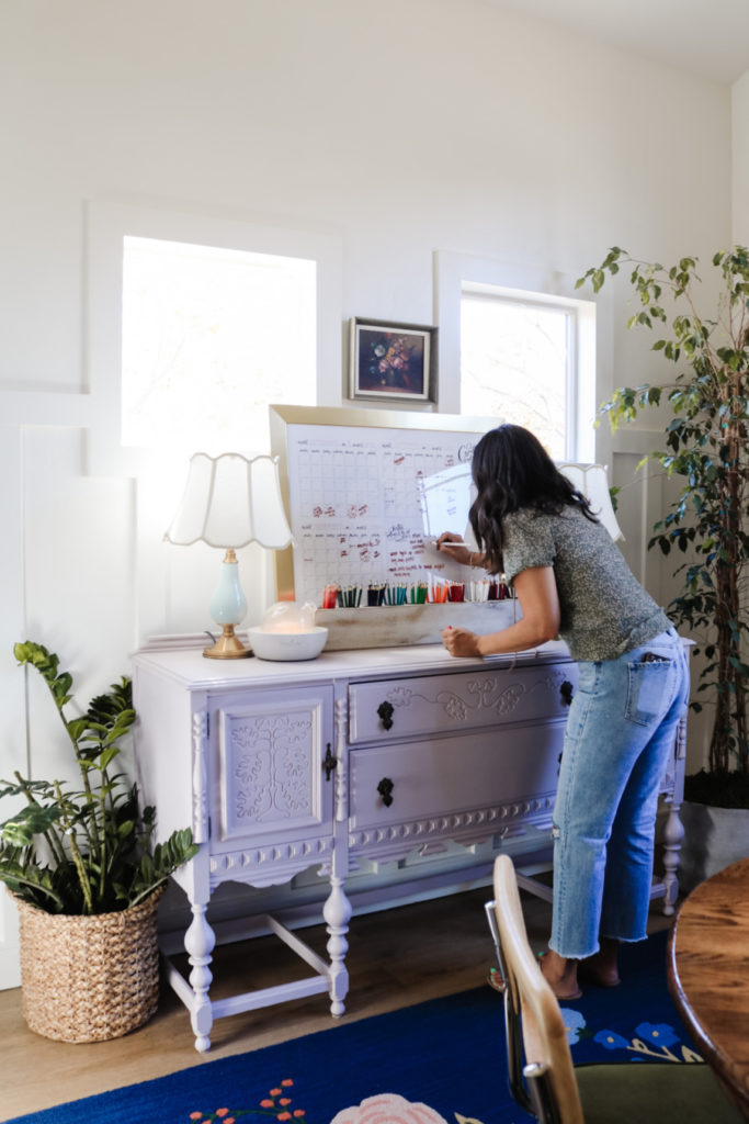
This is what Laila’s office looked like before the paint. Cute, right? All the walls had just gotten painted in one of my favorite white paints, Cloud White from Benjamin Moore. The white felt so nice and fresh, but a year later she was ready for color. (Her floors are LVP, Stockbridge Oak Ridge Core).
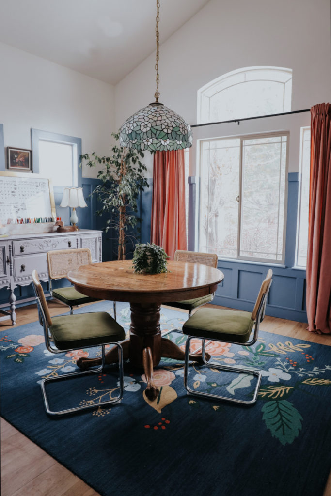
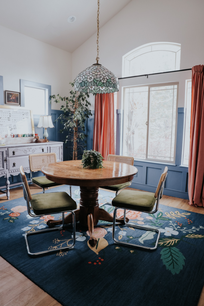
And this is Laila’s office after paint! Looks finished, inviting and complete! I especially love the trim painted around the widows. It feels so cozy and curated.
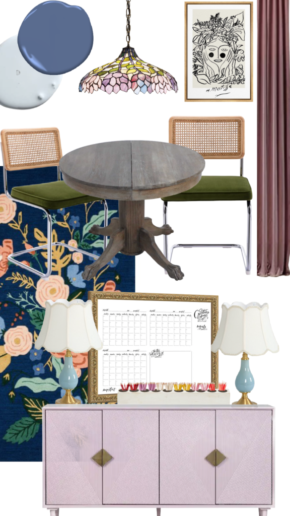
Floral Rug // Chandelier Light Fixture (Laila’s is vintage) // Mid-Century Dining Chairs // Floral Women Art
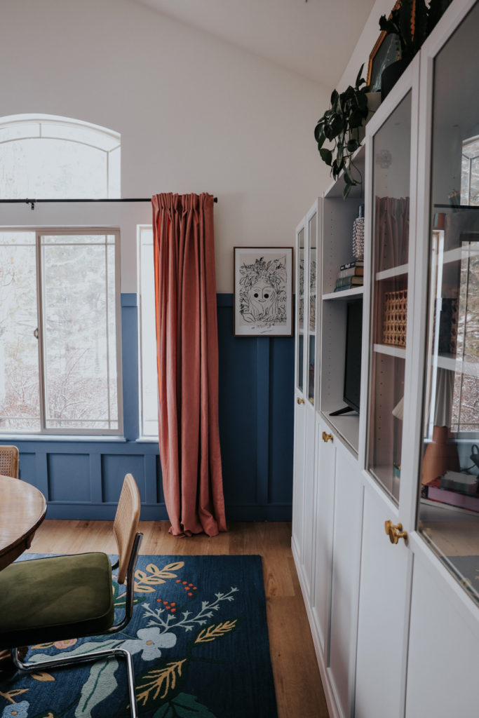
Velvet Curtain Panels // Blue Lamps // Cane Basket // Pencil Holder
Dry Erase Calendar (we use these fine tip markers) // Console (Laila’s is thrifted)
Benjamin Moore Color of the Year
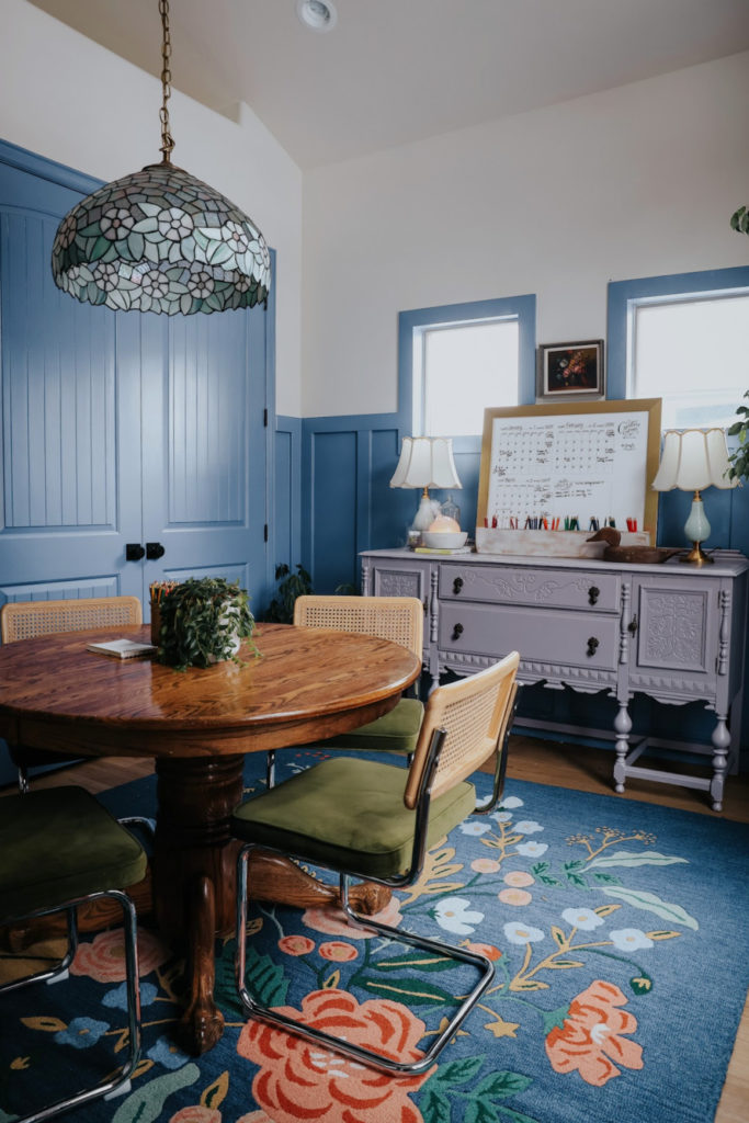
Did you know that paint companies have colors get announced “color of the year”? Their teams review trends in fashion, architecture, design, travel and many other area to help and inspire what they predict will be the most popular color of the year. For this year, 2024, Benjamin Moore announced, Blue Nova to be the color of the year. This is the color we used in Laila’s office!
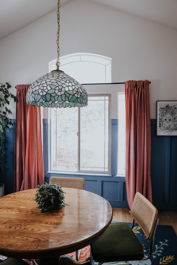
When I showed Laila she agreed that it would be such a beautiful color for her office. Love that Laila has full trust in the process, and like me, thinks why not try it?? All the new colors we added to the room compliments her vintage inspired Tiffany chandelier!
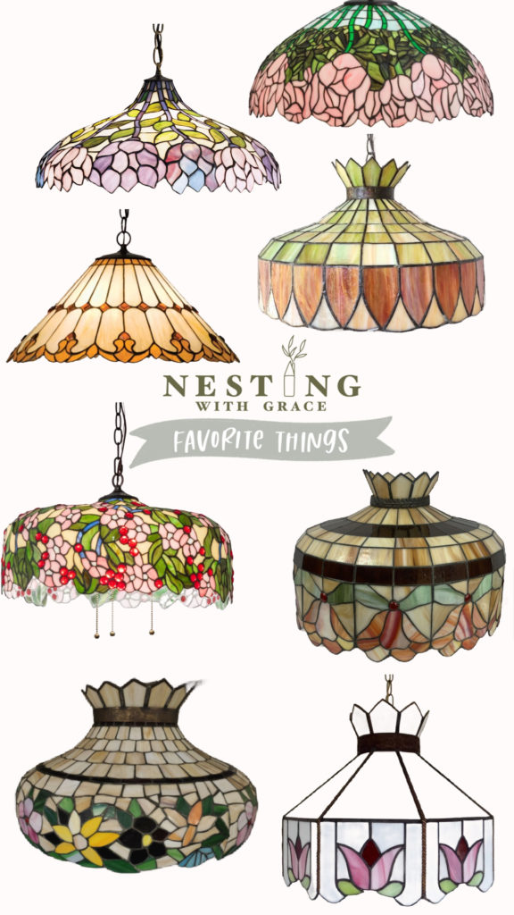
Tiffany Inspired Chandeliers HERE
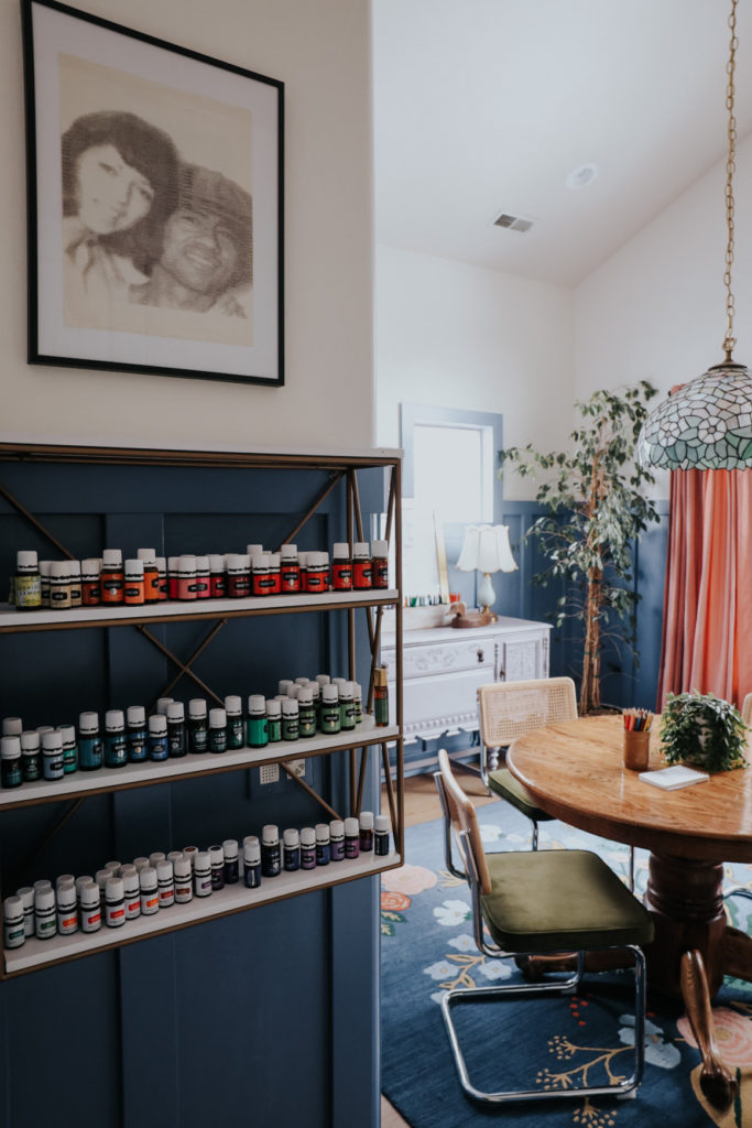
It’s fun to see how, just by adding color, other items pop! PS- her oil shelf is from Home Goods, and she get’s her essential oils HERE.
IKEA Bookcase Upgrade
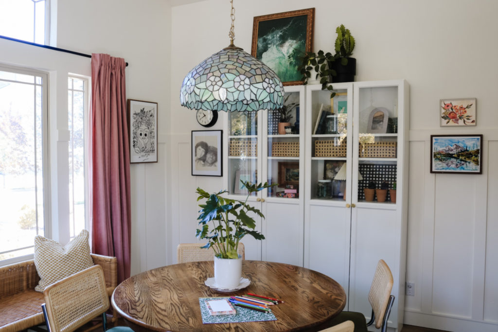
Laila had these IKEA bookcases already, they are great, we just decided she had room to add another bookcase. More storage and, a TV, that she loved to have in here while wrapping gifts at Christmas.
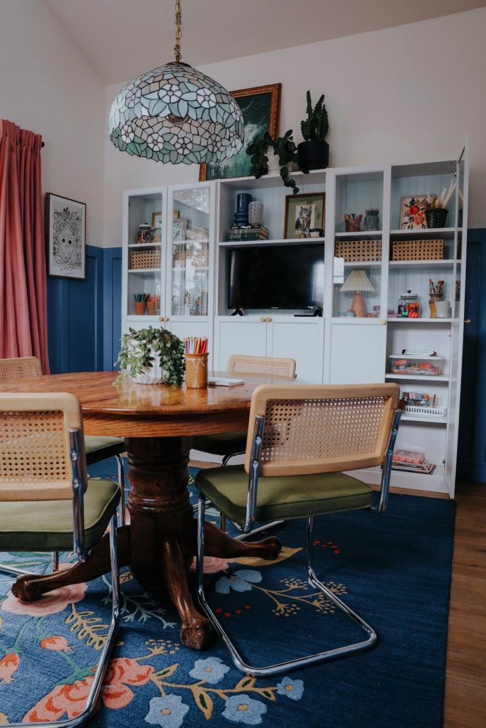
Here are the bookcases now! We added a third IKEA bookcase, with the addition of our own spin (and color) to it.
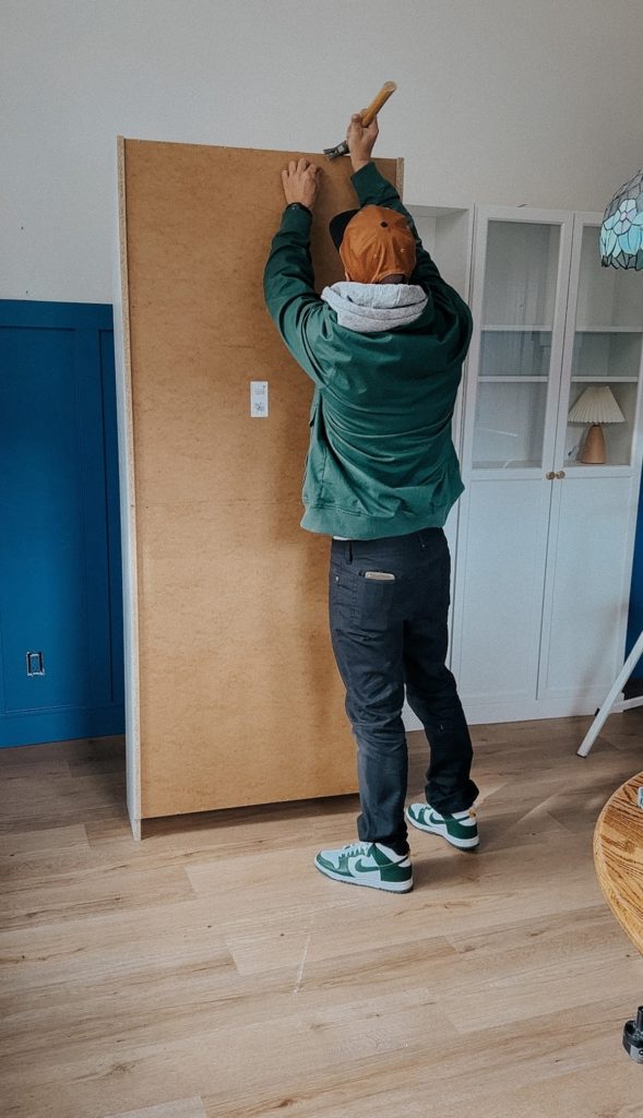
First, we took off the back of each bookcase, just used a hammer to pop off the nails.
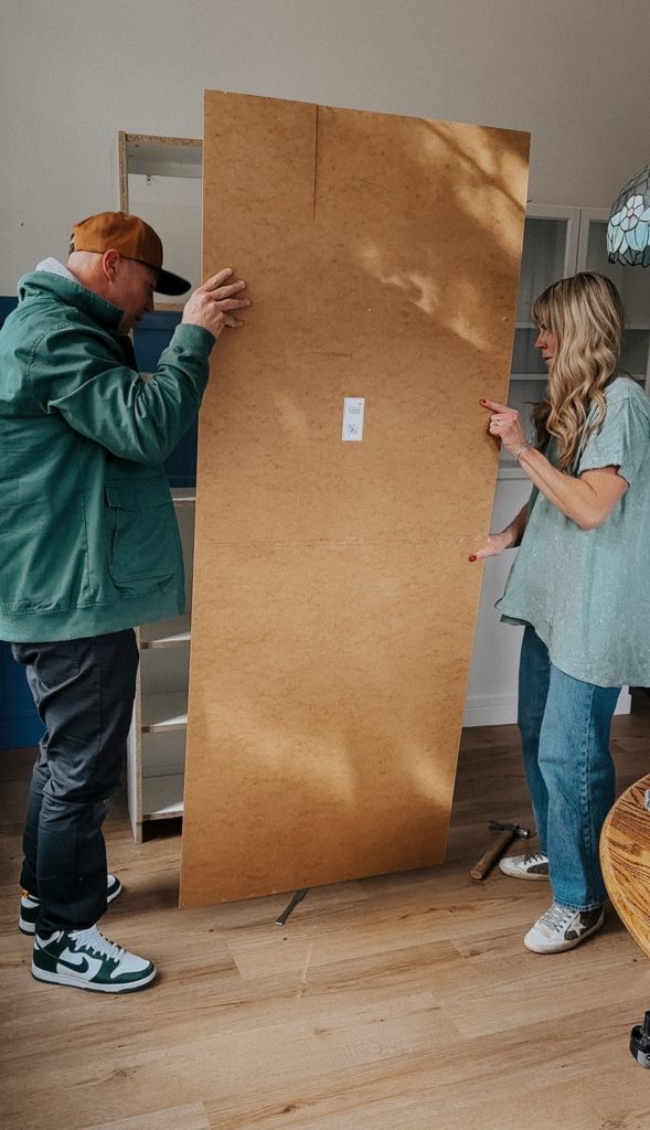
We cut the back board in half, so we could put the original back on the bottom part that is covered with cabinet doors.
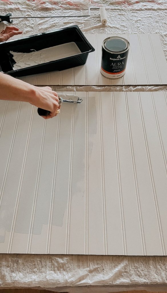
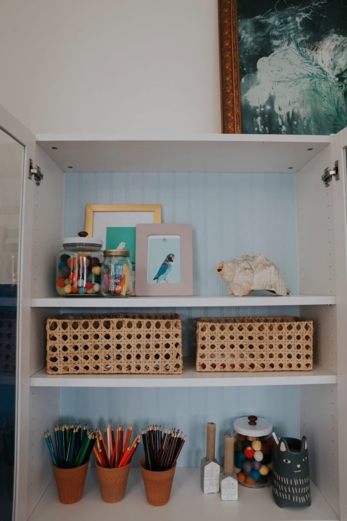
We painted the beadboard this pretty light blue color, called Polar Sky from Benjamin Moore.
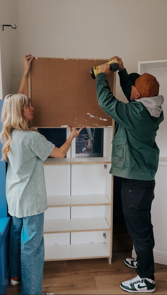
We got beadboard sheets, and cut them so the lines ran vertical. We made our cuts based on the shelf spacing, so the seam would be hidden behind each shelf. We just used a pin nailer to attach each beadboard to the bookcase. And caulked any gaps.
Notice the separate pieces that have the beadboard (top) and then hung the regular backing to the lower half of the bookcases.
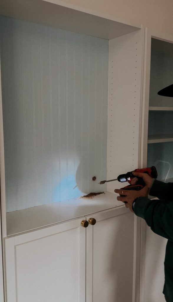
You can already see the cute color difference! Kevin drilled a hole that the television cord could go through.
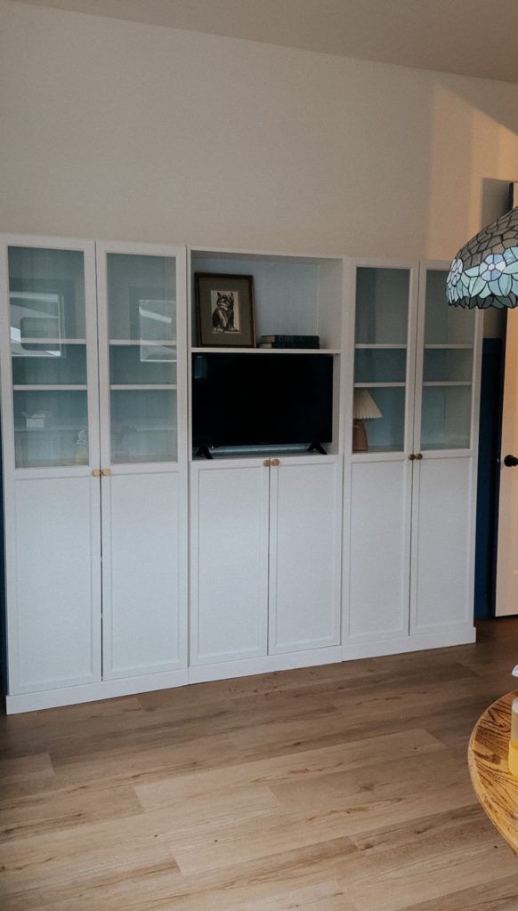
Same shelving, but different! Looks custom, and we love that she has more storage! Plus now has a spot for their TV, which come in handy when doing longer craft projects, wrapping gifts, Finn uses our TV a lot for Art Hub.
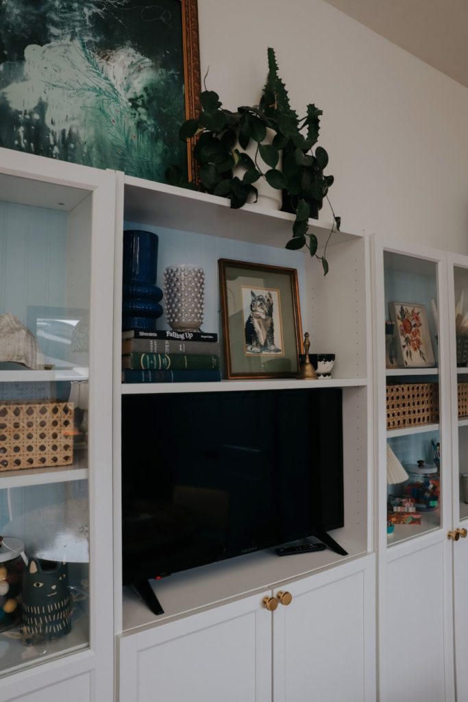
I love styling shelves! Laila’s office has lots of color which makes the shelves extra fun to decorate. You can see I used the same baskets all the same height across the shelves to connect them. PS- gold knobs from HERE.
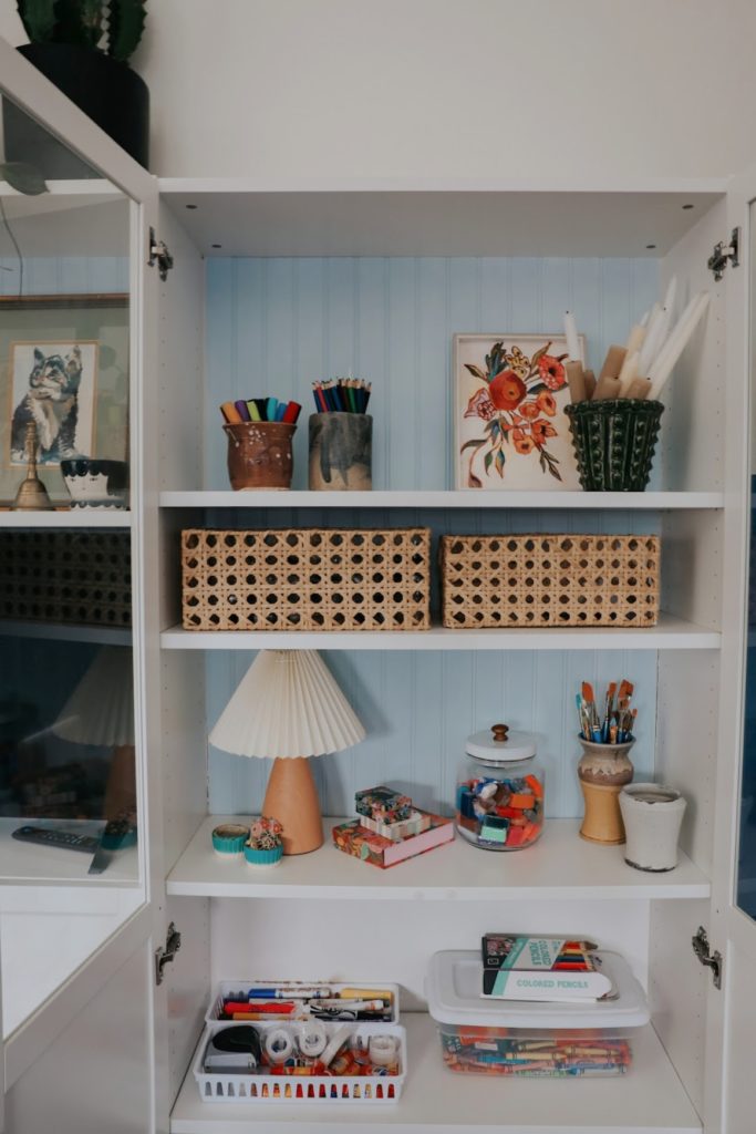
Practical and thrifted pieces make for the best decor for shelves, and love a mini lamp in a bookcase, her lamp is not available, THIS is similar (find more lamps HERE).
And then it’s just a matter of balancing them out with the same colors and textures. I am always a fan of using items in your decor that you use on the daily. In her office, that’s arts and crafts!
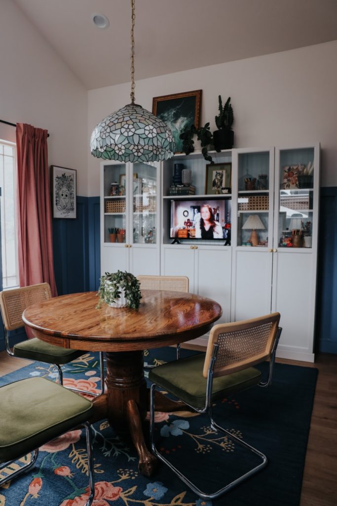
The wall and bookcase blue’s really bring out the colors of the floral rug and vintage chandelier.
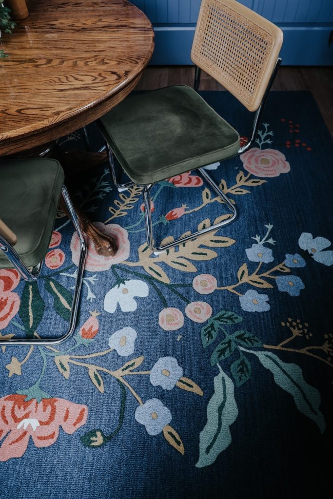
She still loves these vintage inspired dining chairs we used as desk chairs, around a thrifted table as a desk.
Sideboard-
We did change the color on her sideboard, we felt like it needed to be a little darker to balance the darker color on the walls. The first color is Chaise Mauve from Sherwin Williams.
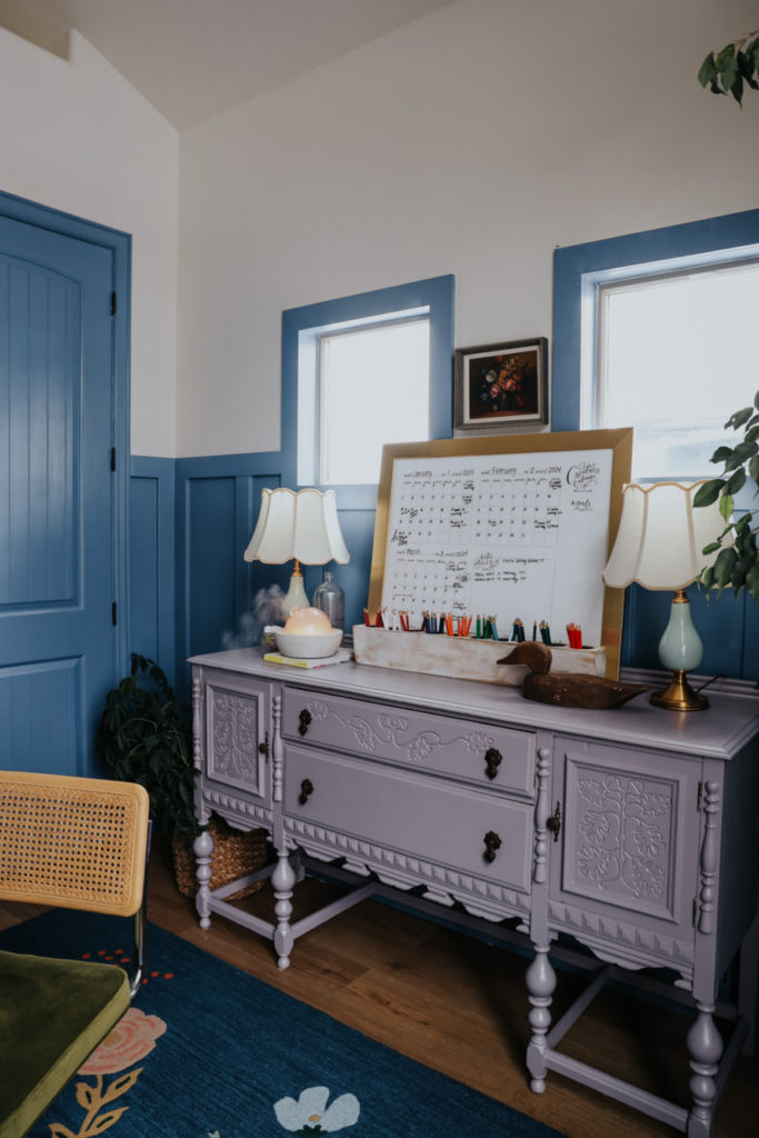
The new color is Hazy Lilac, from Benjamin Moore Advance. The paint covered so easily. We love the color so much!!! We use really ANY clear waterbased polyurethane as a top coat to prevent scratches.
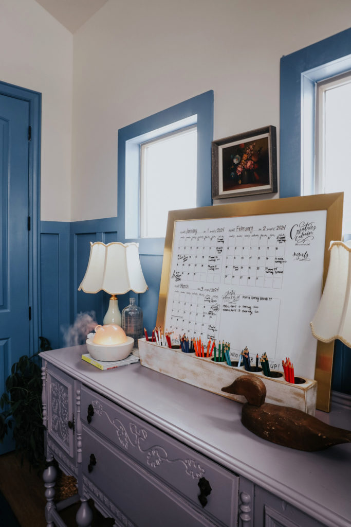
Every office needs a calendar. We did this dry erase calendar that has 3 months at a glance (she has 30×24 with modern gold frame, these are the best dry erase thin markers). And she has my matching Pencil Holder that we have in our home office, adds the right amount of color and is practical too.
We love how the painted walls made it so you don’t need a lot of extra things, the paint is the statement. When we decorated her office over a year ago we felt that we need a bench under the window, after painting the walls we took out the bench, since it was tight to walk around and never used. The wall color fills in an empty space!
We hope this shows that a room isn’t done until you say it is! Enjoy the process and try the bold paint color!

I loved this room before and love it even more now! I am going to add beadboard to the back of my Ikea shelves, too. I love that idea!